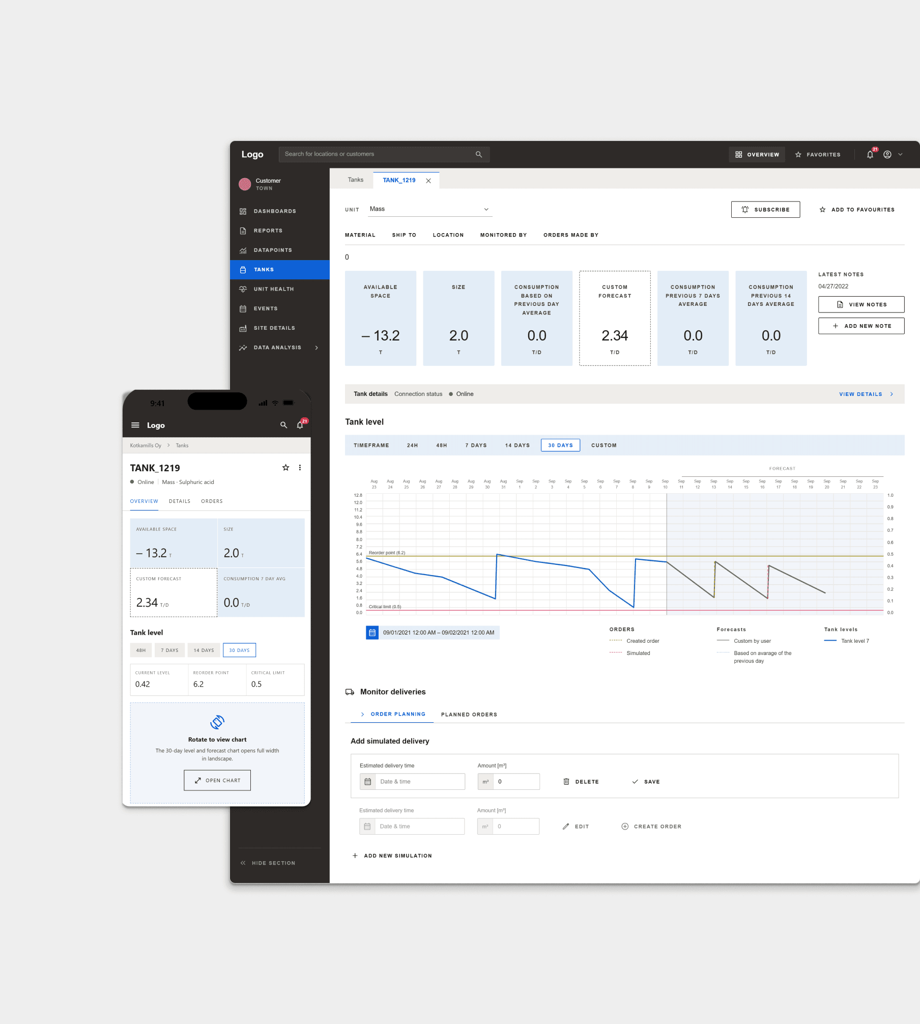
Industrial Data & Expert Interface Design
Built practical expert tools for industrial data workflows, making complex calculations and monitoring more reliable for specialists.
View case study →Case study
Public Sector PlatformA shared, standardised design foundation for complex municipal education systems, unifying usability and logic across several platforms.
Role: UX & Product Designer, and later Lead Designer, over a three-year period
Focus: Service design, Design Systems, and cross-team design consistency across a multi-vendor public sector platform
Starting Point
A consortium of public sector organizations needed to replace legacy systems used across basic and upper secondary education, serving many municipalities with different needs. I joined as UX & Product Designer, later becoming Lead Designer, over a three-year period.
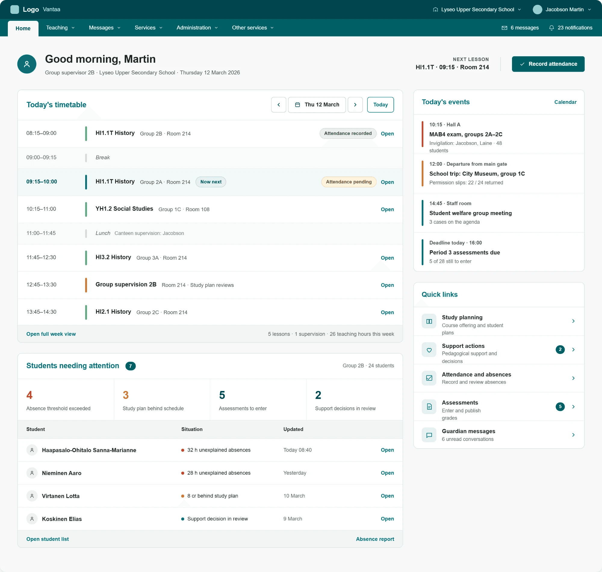
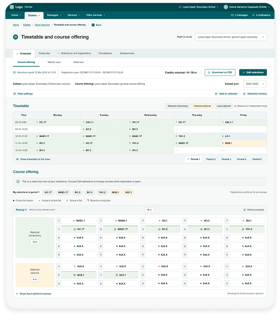
Selected screens
Desktop and mobile, one platform
The Impact
Feedback from the pilot schools has been largely positive. The platform has been described as easy to use, versatile, and modern. Teachers and administrative staff in particular praised how logical the service felt and how well it supported everyday school routines. Usability and speed stood out specifically, with users reporting that they could find what they needed quickly and easily. Practical use cases, like printing report cards and transferring student data, proved reliable in daily use. End users, including teachers, were also involved directly in acceptance testing, which helped ensure the platform actually fit how teaching work happens in practice. The platform only launched in spring 2026, with a wider school rollout this autumn, so the full impact is still ahead of us — what we do know so far is that we delivered a consistent, accessible foundation that several municipalities are now building their daily school administration on.
We replaced complex, outdated legacy systems with interfaces that are genuinely easier to understand and use, for teachers, administrators, guardians and students alike, built around real user needs instead of old system logic.
Legacy systems had mobile apps, but they were often confusing and frustrating to use. For many guardians and students, this may be the first time managing school-related tasks on a phone actually feels easy instead of like a chore.
Despite several development teams and third-party platforms working in parallel, we delivered a visually and functionally consistent experience, something that's genuinely hard to pull off at this scale.
How it started
The project began with a team of three designers (2 UX and 1 Service Designer), running structured workshops as part of a discovery process based on a three-step research model, close to the Double Diamond method. First, we mapped the current state and existing pain points. Second, we explored what an ideal future service could look like. Third, we co-designed concrete concepts with stakeholders, building on insights and sketches from the earlier phases. This research generated a large body of material that became the foundation for the service design and development that followed.
Within the team, I was primarily responsible for the visual design work, creating the concepts and mockups, and making sure the quality of the work held up throughout. I proposed the three-phase workshop model and led it, together with the other designers and the product owner, and later ran the additional workshops we needed whenever we designed the parts of the service that fell under my responsibility.
Challenges & Problem-Solving
What I would do differently
Other case studies
Built practical expert tools for industrial data workflows, making complex calculations and monitoring more reliable for specialists.
View case study →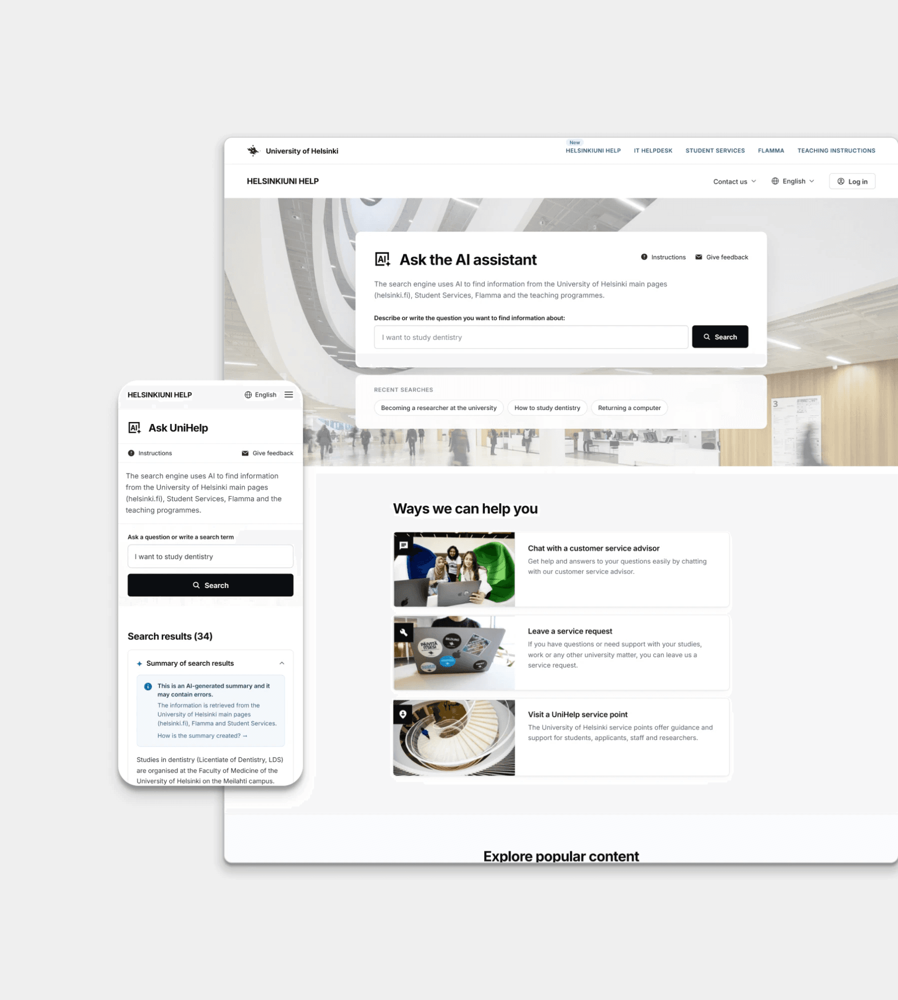
Designed a smarter search and service hub so students can find guidance and support without getting lost in fragmented systems.
View case study →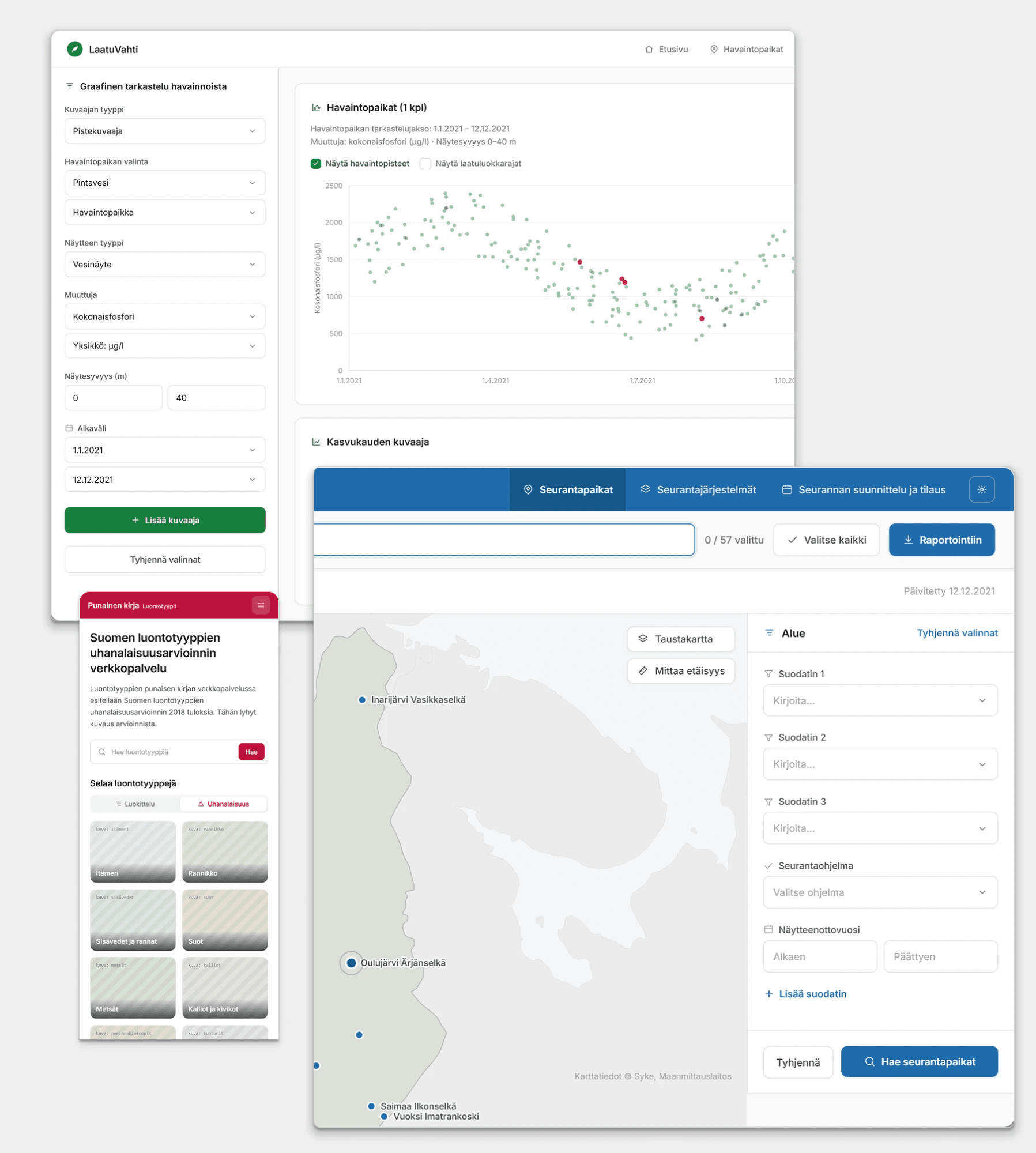
Transformed outdated legacy systems into modern, efficient tools that help environmental researchers manage and analyze critical data.
View case study →Currently in process
A personal design system covering tokens, components and documentation, built to show how I structure and maintain a system end to end.
View case study →